What is data visualization, how do you do it effectively, and why does it work so well?
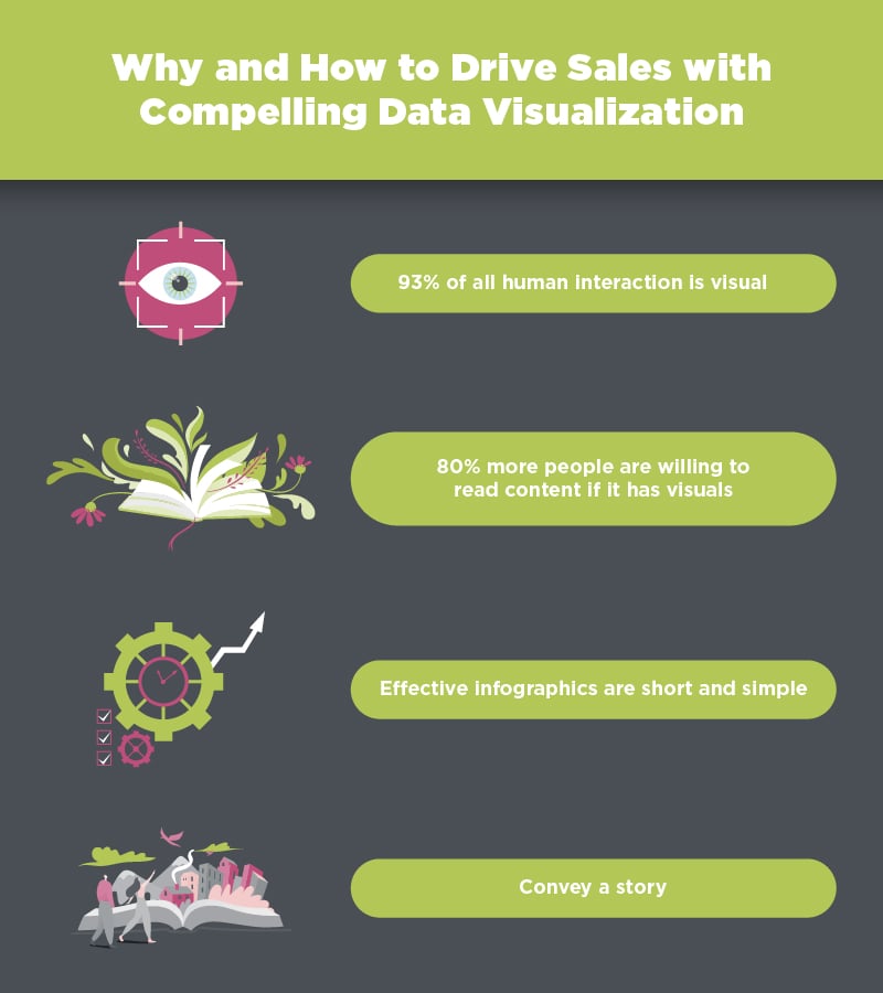
- 93% of all human interaction is visual
- 80% more people are willing to read content if it has visuals
- Infographics aren’t as effective if you overload them with information
When you’re creating your content marketing strategy or new individual campaigns, it’s easy to focus solely on your written content. You want to ensure that your words are representing your company and the helpful information you’re trying to convey. But remember that while quality copy is important, you can more effectively communicate when you incorporate visuals.
Tracking and analyzing data are crucial components of understanding your business and sharing information with your audiences. Knowing how to share that information in ways that people will care about, however, is another matter entirely.
People love exciting visuals, and data visualization provides just that. Infographics can help you generate more interest, keep people’s attention longer, and tell your story in more effective ways.
Here’s what you need to know about why data visualization works and can lead your business down the path to growth.

Why data visualization boosts content marketing
Humans respond to information when we can see it. In fact, 93% of all communication is visual. Understanding this simple point about your audience can help you create more visually appealing marketing messages.
For example, infographics are easy to digest and present information in a way that’s appealing to consumers. Instead of solely providing paragraphs and paragraphs of content, you can generate excitement and interest by breaking down key points into tastier visuals.
Our brains love the opportunity to understand something in a simple format that doesn’t take much time to read or process. So, why not give your customers what they want and create more visualizations of your data?
Here are a few tips and considerations when you’re thinking through your data visualization strategies.
Color is king
We are visual creatures. When a color pops, we notice it. When there’s something bright and shiny in front of us, we want it. This is why using color in the right ways can make or break your content.
Choose a base color that you feel represents your brand’s vision. Make sure it’s a color that’s appealing to you, but that will also be pleasant for customers to interact with. Then, choose accent colors that will compliment your base color and stand out on the page. Our eyes love to see dimension and variety in content, especially online. But only choose a few colors so that your graphics don’t become too messy or overwhelming.
When you can effectively blend color design and top the cake with killer content, you’ll see much better ROI in your campaigns, and people will care more about what you have to say. Research has found that people are 80% more willing to read content that has color visuals.
Keeping it simple
Infographics won’t be as effective if you overload them with information. The whole point is to be able to summarize and simplify. Make sure that your data is represented cleanly and clearly, without a lot of text to scroll through.
Use numbers and percentages whenever possible. Graphs, charts, and tables are also helpful ways for your audience to understand your data. Only include key points so that there are clear takeaways that you want readers to have.
Infographics should help people make sense of what you’re saying. When they can come to the “ah-ha” moment faster, they’ll be more likely to become interested in your products or services. They’ll be able to reach conclusions quicker. And their attention spans won’t start to wane, leading them elsewhere to get the information they’re looking for.
Incorporate a story
Another important thing to remember is that an infographic should still have a point. You still need to create and tell a story with the data you’re showcasing. What does it mean? What’s the point of sharing this information? Why should your audience care?
As you guide them through the data, make sure it flows together. Everything should be relevant to what you’re trying to communicate. Even though words may be minimal, graphics are powerful in creating narratives that drive behavior and action.
Boost sales and engagement
All of these factors lead to one important outcome: more sales for your business. Sounds pretty great, right?
When you know how to effectively balance content and graphics and present data in skimmable, appealing visual formats, you will generate more interest, engagement, and clicks.
Creating the perfect visual means nothing if you don’t have the content to present it. If you’re not sure how to get started, check out our blog, The Search for Inspiration: How to Generate Content Ideas, for ideas.
